
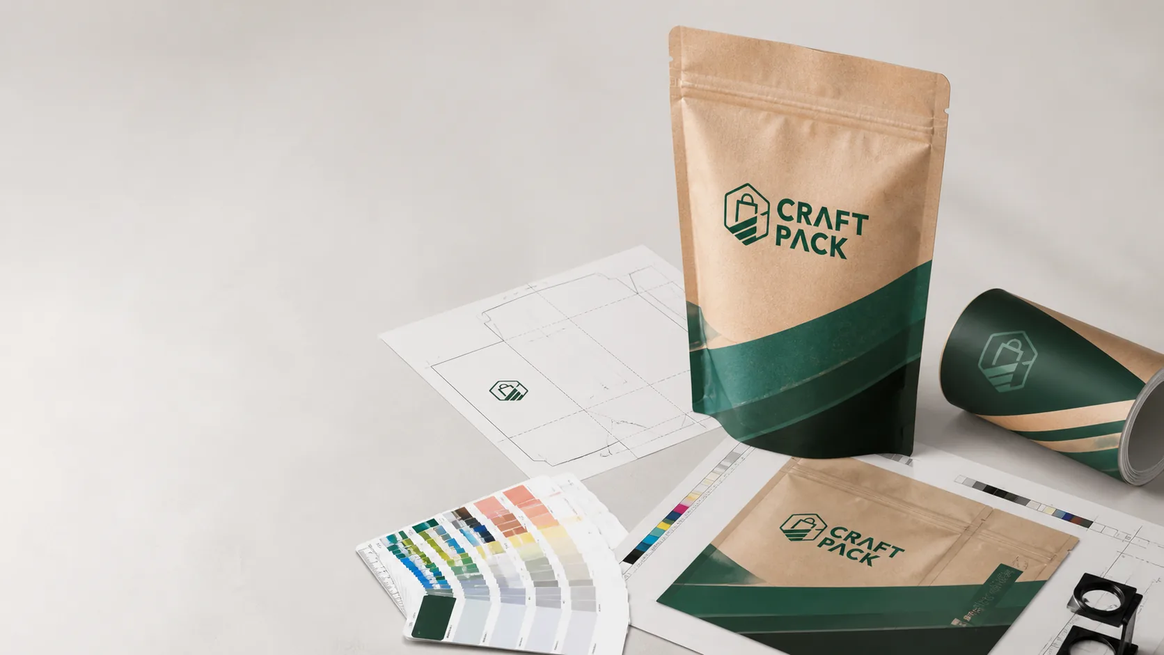
Custom Packaging Printing: A Prepress and Artwork File Guide
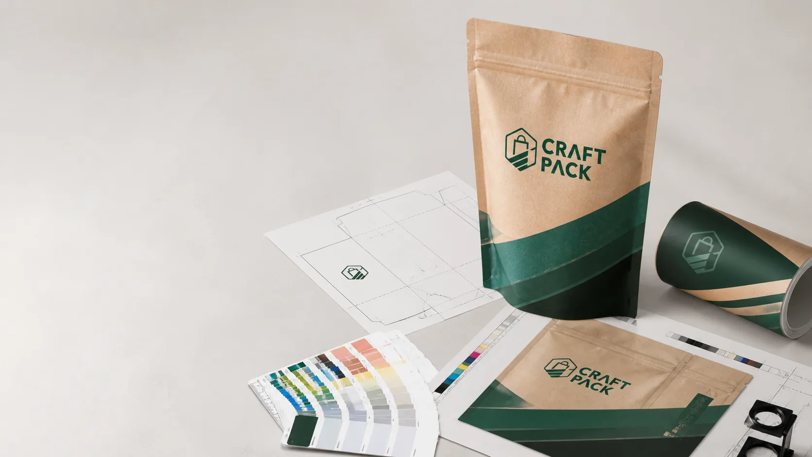
The most common cause of a packaging reprint is not the printing itself. It is the artwork file that was never prepared for production. A design that looks perfect on screen can arrive with missing fonts, low-resolution images, colors that shift between screens, or text placed inside the sealed or folded area of the bag.
Custom packaging printing involves more than uploading a design. It means choosing a print method that fits the order quantity and material, preparing artwork in the correct color mode and resolution, working from an accurate dieline, and approving a proof that matches the final production result.
This guide explains the prepress steps that reduce errors and reprint costs, with a focus on the flexible packaging formats CraftPack Global produces, including stand-up pouches, paper bags, and e-commerce mailers.
Choose the print method after the structure and quantity are clear
The print method should follow the packaging format, material, and order volume rather than lead the specification. If the material structure is still undecided, start with our material selection guide before locking the print process. The three methods most relevant to custom packaging are rotogravure, flexographic, and digital printing.
Rotogravure (gravure)
Rotogravure prints from engraved cylinders and is often chosen for high-volume flexible packaging orders. It can deliver consistent color, fine detail, and large print coverage across long production runs.
The trade-off is the cylinder cost. Each color typically requires its own engraved cylinder, so gravure usually only makes economic sense when the order quantity is large enough to absorb that setup cost over the run.
Flexographic printing
Flexographic printing uses flexible plates and is common across a wide range of packaging, including paper bags, mailers, and pouches. It is often more economical than gravure at mid-range quantities and supports a broad range of substrates and inks.
Plate and setup costs still apply, and there can be practical limits on fine detail and tight registration compared with gravure.
Digital printing
Digital printing requires no plates or cylinders, which makes it attractive for small batches, samples, and short runs. It is frequently used when a brand needs a limited quantity, a fast first production, or a design that changes frequently.
The unit cost is usually higher at large volumes, and the available substrates, finishes, and color-matching process can differ from conventional printing. Ask the supplier which method they recommend for your quantity and material before finalizing artwork.
Practical guidance
The same artwork may need different preparation for different methods. Confirm the print method and the supplier’s file requirements before designing, so the artwork is built for the process that will actually print it.
Prepare artwork that survives production
A screen design is not automatically print-ready. Suppliers commonly request files prepared to specific standards, and the most frequent problems are preventable at the design stage.
Use vector files for logos and text
Logos, text, and line-based graphics should be supplied as vector artwork (commonly AI, EPS, PDF, or SVG) so they can scale without losing sharpness. Photographs and scanned artwork should be embedded or linked at the resolution the supplier specifies. Low-resolution images that look acceptable on a phone screen may print soft or pixelated on packaging.
Convert to CMYK or spot color
Design screens use RGB, but most conventional packaging printing uses CMYK inks or spot colors such as Pantone. Converting late, or not converting at all, can change how colors appear in production.
If a specific brand color must match precisely, discuss whether it should be specified as a Pantone spot color rather than approximated in CMYK. Keep the brand color reference consistent across all artwork versions.
Outline fonts and include links
Convert text to outlines or embed fonts so the printer does not substitute a different typeface. Include any linked images with the file package, and follow the supplier’s instructions on flattening or preserving layers.
Build in bleed and a safe area
Bleed is the extra artwork that extends past the cut or seal line, and the safe area is the space inside the dieline where text and important elements must stay. Ask the supplier for the required bleed and safe-area dimensions and apply them to every artboard.
Work from the dieline, not from a photograph
The dieline is the technical template that shows the exact shape, folds, seals, handles, zippers, and cut lines of the package. Place text, barcodes, and logos only after confirming the final dieline.
Key points to check:
- Keep text and barcodes inside the safe area.
- Avoid placing critical content across a seal, gusset fold, or handle position.
- Confirm panel orientation so the front panel shows the intended message.
- Check that the dieline matches the confirmed dimensions and material.
A dieline that changes after artwork is placed is a common source of rework. Confirm the final dieline before starting artwork, and treat any later change as a new version that needs full re-review.
Approve a proof, then a sample
Two stages of approval usually protect a custom printing order: the proof and the physical sample.
Digital and color proofs
A digital proof shows layout, text, and approximate color, and is useful for catching content errors quickly. It does not reproduce the exact substrate or final ink behavior, so it should not be the only approval for color-critical work.
For brand colors, metallic inks, and large solid-color areas, ask for a physical color proof or sample printed on the intended material before approving mass production.
Pre-production sample
A pre-production sample printed with the actual material and process is the closest preview of the final product. Approve it against the dieline, the artwork, and the confirmed specification, and record any discrepancies in writing.
Avoid the most common prepress mistakes
- Supplying RGB artwork without a CMYK or spot-color conversion.
- Placing text or barcodes inside the seal, fold, or bleed area.
- Using a dieline from an earlier version after dimensions changed.
- Low-resolution raster images or missing linked files.
- Fonts that are not outlined or embedded.
- Approving a digital proof without a physical color sample for a critical brand color.
- Changing a color reference or material after the artwork is approved.
What to send your packaging supplier
A complete print file package should include:
- Final vector artwork in the requested format.
- A separate dieline, or the layered file with the dieline on its own layer.
- CMYK and spot-color references, including Pantone numbers where relevant.
- Linked images and outlined or embedded fonts.
- A marked-up proof showing the intended front, back, and side panels.
- The approved material, dimensions, and closure details.
Sending everything in one clearly labeled package reduces revision rounds and keeps the production schedule on track.
Conclusion
Custom printing errors are usually cheaper to prevent than to reprint. Choose the print method that fits the quantity and material, prepare artwork in the correct color mode and resolution, work from the final dieline, and approve a physical sample before mass production.
CraftPack Global guides brands through material selection, print methods, dielines, and proofing for custom pouches, paper bags, mailers, and other flexible packaging. Share your artwork and packaging requirements with our team for a practical printing recommendation.
Explore our flexible packaging solutions or contact CraftPack Global to discuss your packaging print project.